
As the new MLS season dawns, teams have released their new threads for the upcoming season. Here are my rankings for the new jerseys. Let us know your opinion in the comment section below. Our images were sourced from footyheadlines.com.

29. DC United

Wow. Another black kit designed by Adidas. It really can’t get any more boring than this. The stripes are too dark to be able to see while watching on TV. The red highlights don’t stand out, and the need for a sponsor is evident, as the front of the jersey is so bland.
28. Minnesota United

Again, another black MLS kit. Yay! The color scheme on this jersey is absolutely wonderful; black and blue have the makings of an amazing jersey, but of course, adidas decided to make it black with extremely low-key blue highlights. And why is the Target sponsor not blue? Disappointing.
27. FC Dallas

I really enjoyed the 2020 FC Dallas jersey, but this is absolutely horrible. Those horizontal stripes are so bad. And don’t even get me started on the sponsor. Why is it so big? Yikes.
26. Toronto FC

I don’t understand this jersey. If there was any other color than gray, this kit would probably be in the top 10 at least. Maybe that blue from the home kit last year? I don’t understand why the collar says “Come on You Reds” when this jersey has absolutely none of it except for the crest. Although, this would be a nice jersey to cop, as it isn’t too showy.
25. San Jose Earthquakes

A common theme so far has been that if the kit had a different color and design, they would be much higher. That continues. The only reason that this isn’t last is that the side panels are cut from a random cloth, so each jersey is random.
24. FC Cincinnati

This is a weird jersey. Orange as the main color is bad, which is why Houston Dynamo’s jerseys hurt my eyes. I understand that the strange design is supposed to be a C for Cincinnati, but it is so weird. That’s all I have to say for this jersey: weird.
23. Nashville SC

As much as I love the crest of Nashville SC, I don’t enjoy the color of yellow that they use or the purple highlights. For those reasons alone, their jersey is placed 22nd.
22. Chicago Fire FC

Chicago Fire’s new crest is fire. (Get it?) But in all retrospect, the underlay designs are cool, but they aren’t visible while watching on TV. The jersey looks a lot better while the pro players wear it, as Motorola is a great sponsor. Otherwise? It is just an average jersey.
21. Sporting Kansas City

Another jersey with an amazing color scheme, but a boring design. The area codes are a novel idea, but they should be in the SKC light blue which is a really amazing color. If this had a more “out there” design, this could be in contention for the top spot.
20. Seattle Sounders
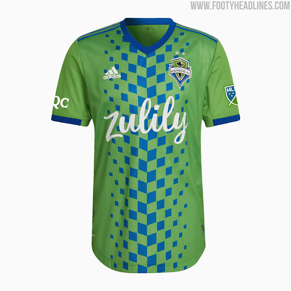
This kit has so, so much potential. The design is nearly perfect, the sponsor is great, but the colors are so bad. Green and blue is a really bad color scheme. There’s a reason why no other team in the MLS has the same colors as Seattle. This would be the best jersey of the year if it was made by the NY Red Bulls, who come up later in the article.
19. Columbus Crew

Finally, yellow jerseys are back! Yellow and black are a great combination, but the jersey is just too plain, a common theme for MLS teams. Both sponsors are really effective, but again, the jersey is much too plain.
18. Colorado Rapids

This is a really great jersey. The color scheme and design are both executed very well, but the lack of a sponsor really pulls this jersey down to 18th. If this had a good sponsor, it would be much higher up the list.
17. Charlotte FC
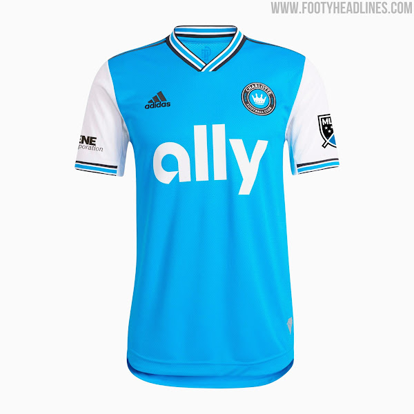
The expansion side’s newest home jersey is an Arsenal-Esque effort (something we’ll see more of later) that combines blue and white in a good effort. I just wish that the Ally sponsor was smaller, as it takes up way too much of the jersey. The jersey just needs a good design for it to be taken to the next level.
16. Charlotte FC

Again, the sponsor is way too big, but I am a fan of these colors. My favorite jersey of all time is the 19-20 Borrusia Dortmund Blackout Jersey and this is the closest effort to it on the list, so it is bumped up from the 20’s up to 16.
15. Houston Dynamo

I know, I know. I’ve been hating on all of the black jerseys, but this one is just better. It’s the only one with an underlying design, similar to Leicester City’s 21-22 home kit, which is why it is the best one of the bunch.
14. Real Salt Lake

This is a really classy jersey. The colors work well together, the sponsor is nice, and the collar is so, so clean. If I had this jersey, I would wear it as much as I could, as it is a nice kit.
13. Vancouver Whitecaps FC

The Whitecaps finally brought the great hoop design to the away kit. This has a great color scheme and an amazing design. The sponsor graciously allowed its logo to be recolored, and the jersey really benefits from it. This is a very desirable jersey that I would definitely wear.
12. CF Montreal
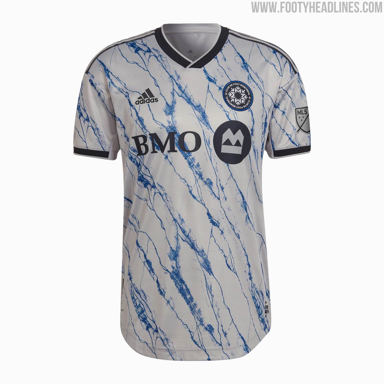
Another Arsenal-Esque jersey. But while Charlotte’s jersey looks unique, this one is an exact copy of the Arsenal 20-21 away kit, just different colors and opposite direction of the marble design. If this wasn’t an exact copy of the jersey, this would be so, so much higher. Why would you do an exact copy only one year after the original one was released? This kit is still class though.
11. NYCFC

This is a really bold jersey. The design is a creative one, but the colors, the colors. What is the color choice? If these colors were switched, I think this would be so much better of a jersey. No questions asked, if this had a better colorway, I would definitely buy it.
10. Inter Miami CF
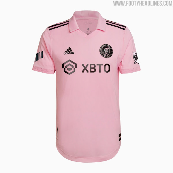
Finally, Inter Miami came out with a pink jersey. After the boring white first jersey, Inter Miami listened to the fans and came out with a pink shirt. The shade of the jersey is really nice, but whoever made the collar should be fired from the adidas design office. It’s so ugly. I wouldn’t buy this as I would never wear the collar.
9. New England Revolution

I love jerseys with checkers. This fits the bill perfectly, but just not significantly. The checkers are not that visible and for that reason, it is not in the top 5. The colors work really well together and the new logo is so clean and is one of the best in the league by far.
8. LA Galaxy

Dubbed the “City of Dreams” jersey, the LA Galaxy home kit shows just how much a collar and sleeve design can change the entire jersey. This is a plain shirt with all white coloring, but I feel that if there was one of the underlay designs I have been wanting throughout this article, it would actually diminish the quality and design because this jersey thrives on being symmetrical.
7. Austin FC

When I first laid eyes on this jersey, I thought it was going to be number 1 on this list. But after further consideration, I realized the color scheme is great, but there’s no design on it whatsoever. The club supporters constantly chant “Verde” which inspired this color of the jersey. If this had some sort of a verde underlay design, I would be so much happier with this.
6. Philadelphia Union

Helped designed by the Creators’ Collective, a group of Union supporters who help the club with design decisions, The For U kit brings back memories of the inaugural Philadelphia jerseys with the center stripe. This jersey has a modern take on it with the stripe slightly off-center, which I really enjoy. The gold sponsor is extremely classy and elevates this jersey to another level. I would appreciate it if more clubs produced their new kits in collaboration with the fans, so we don’t end up with more dull white and black jerseys.
5. Orlando City SC

Inspired by the beautiful sunsets of Florida, Orlando City came out with a wonderful jersey. This is one of the best jerseys this year and will go down as one of the most iconic ones in MLS history. The way the Orlando purple changes into a gradient of orange and yellow is so great. Wow.
4. New York Red Bulls

As I already mentioned, I love checkered jerseys, and this fits the bill perfectly. The checkers are visible, which is a necessity for me. The bright red is a quality color many MLS should use. This jersey would be number 1 for me in a normal year, but the top 3 jerseys are out-of-this-world.
3. Portland Timbers

This is a controversial jersey. The bold rose design isn’t for everyone, not to mention TikTok as a sleeve sponsor. But for me, it is worth the risk. The roses are a great touch, but the “Vapour Pink” in the background is a strange color. It looks like a pink version of vomit. Gross color critiques aside, this jersey has a great design and even better execution.
2. LAFC
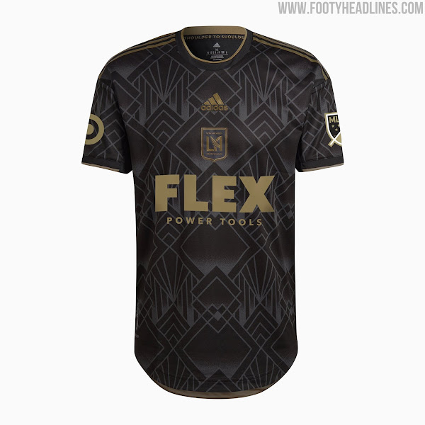
To commemorate the fifth anniversary of LAFC, they used the design of the inaugural jersey but with more LA-inspired deco art. This is what black jerseys should look like: good highlight color and good design. LAFC takes it to a whole other level with this. The diamond graphics throughout the jersey are so clean and just elevate the whole experience. The only thing that I don’t like is the centered logos, which I feel would be so much better in a traditional layout.
1. Atlanta United

Atlanta is known as the City in the Forest and because of that, Atlanta United produced the “Forest Kit.” This jersey is amazing, in both color and design. The mint green is unique and the shades of white provide a nice touch to the shirt by providing some balance. The design is inspired by the iconic Holland ’88 (look it up) shirt that now retails on eBay for over $500. Executed perfectly, Atlanta United fans will have something to cherish and savor for many years.
That concludes our 2022 MLS Jersey Rankings. Drop a line below if you have thoughts on the article or contact us here.
Great commentary – hilarious detailed notes. I’m curious what the Portland Timbers are doing with their second jersey (home/away) – I love the roses (and the pink).
#18 is the best ngl